Redesigning Canvas
A UX case study for Canvas’s UI design
At my University, we use Canvas to turn in assignments, keep track of test dates, and communicate with our professors. Canvas is a widely used tool for universities and high schools to allow for communication between the educator and the student, as well as plan for the school year with a calendar and notification feature.
Despite the wide use of the platform, I have had frustrations with the application and have heard others say the same. I took this as an opportunity to redesign the user experience for my peers and get more experience with user testing and design. Throughout my usability testing, I discovered that users neglected product features due to confusion. Per my research findings, I designed solutions and validated them with subsequent usability tests.
Overview
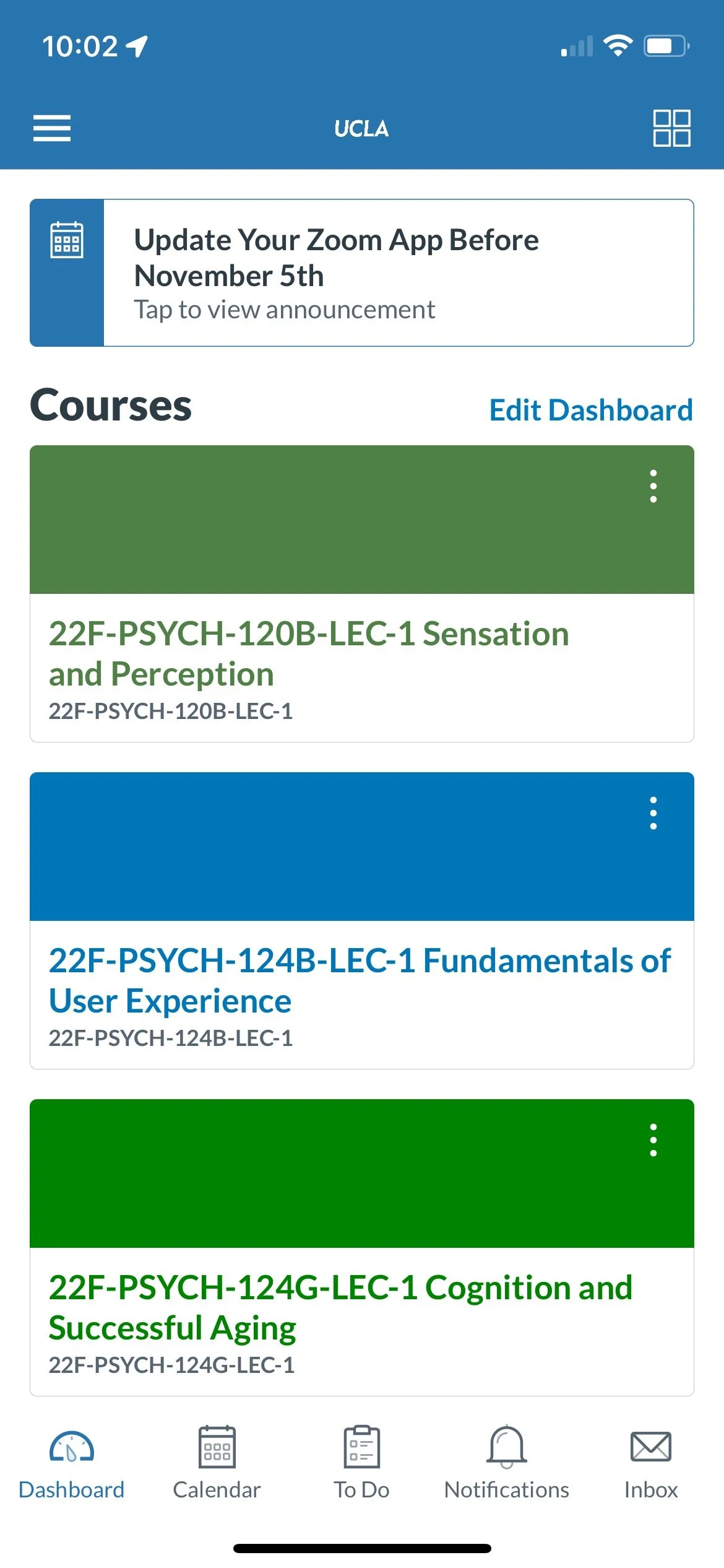
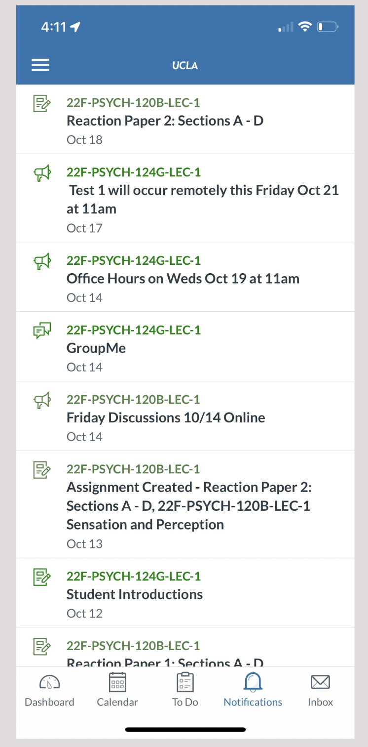
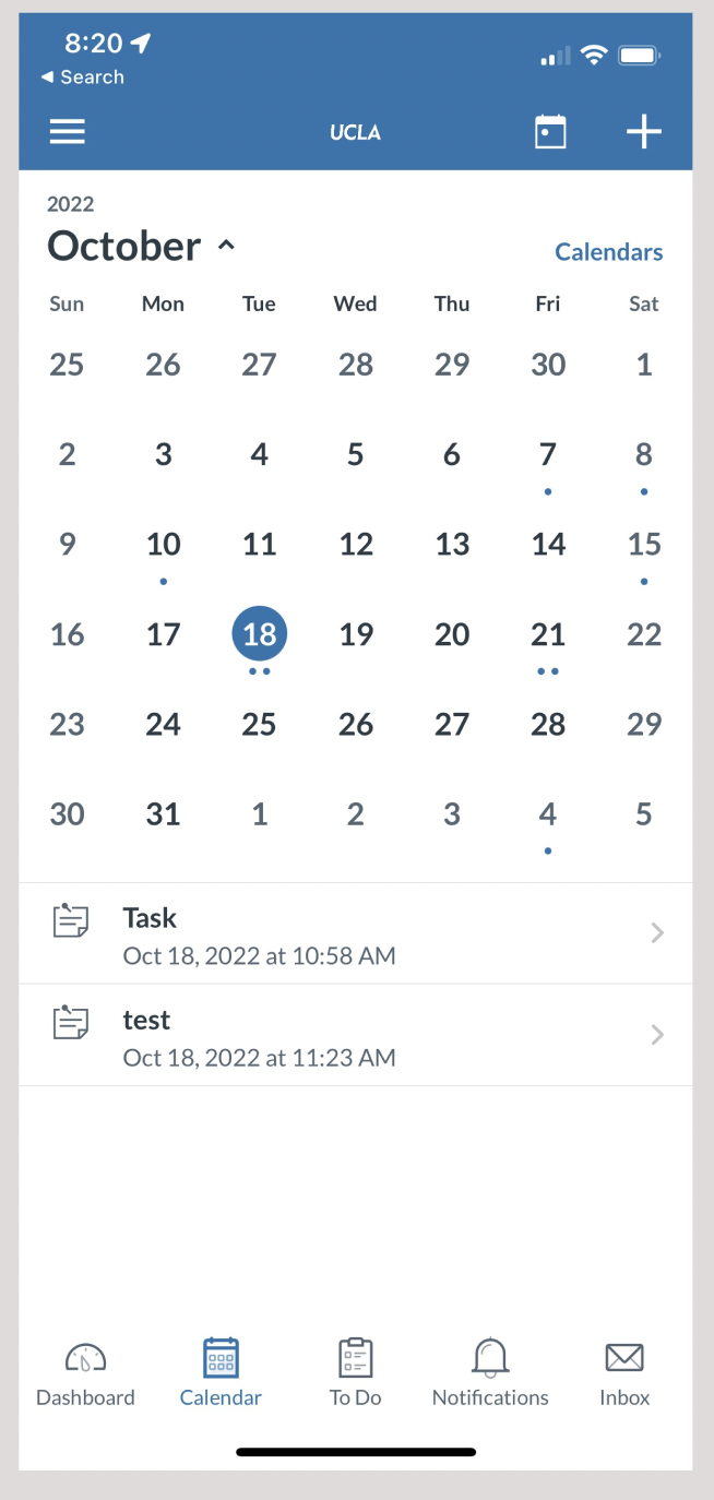
Current Canvas iOs App
Improve the user experience for students using Canvas by improving its UI
Take on the roles of User Researcher and Designer
Personal Goals
Understanding Canvas’s Users
I began my case study by researching Canvas as a brand and learned about their customer's demographics and competitors. Canvas is a feature built by an IT Consulting company named Instructure. Its competitor is Blackboard, a learning system built by Anthology.
Canvas’s target demographics are high-school and college students between the ages of 15 - 25 years of age. Its customer base also includes teachers and professors between the ages of 30 - 65 years of age.
Target Audience
Online Survey
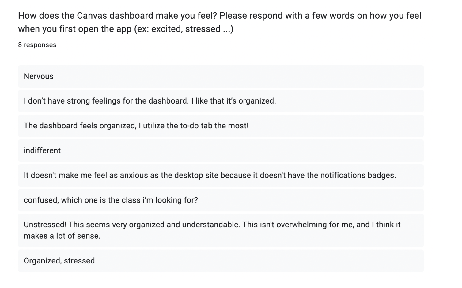
I thought that most students would feel overwhelmed by the Canvas dashboard. To my surprise, most students felt indifferent. Most people saw it as organized and did not have an issue with the interface.
A few students reported feeling stressed or nervous. One hypothesis is that the students who felt nervous may have underlying anxiety from school, but not necessarily from the application itself.
What I anticipated
Usability Testing
I surveyed students around the UCLA campus and asked them to perform the following predefined tasks:
“Add a task to the calendar”
“Delete that task from the calendar”
“Locate the notifications page”
“Unsubscribe to the notification”
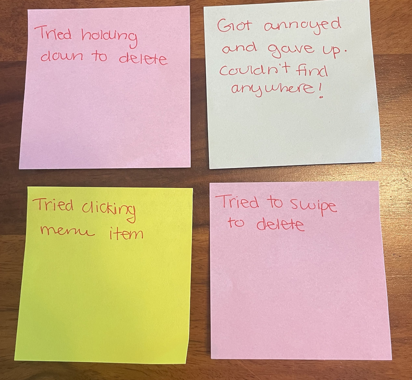
I grouped my observations together and created an affinity map. This helped me identify the key issues among participants.
Analysis
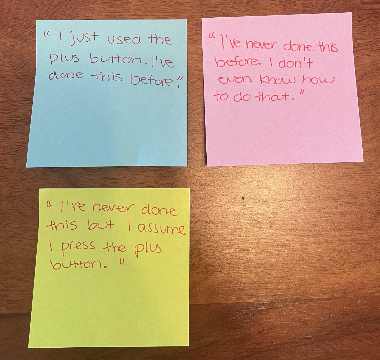
Quotes
Locate notifications
Add a task
Deleting Task
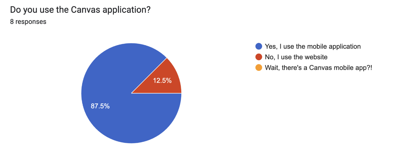
Almost everyone I interviewed uses the Canvas app, however, 75% of the group has never even touched the calendar feature, and only 25% use the notification feature to keep track of their assignments.
Identifying the Problem
User Persona
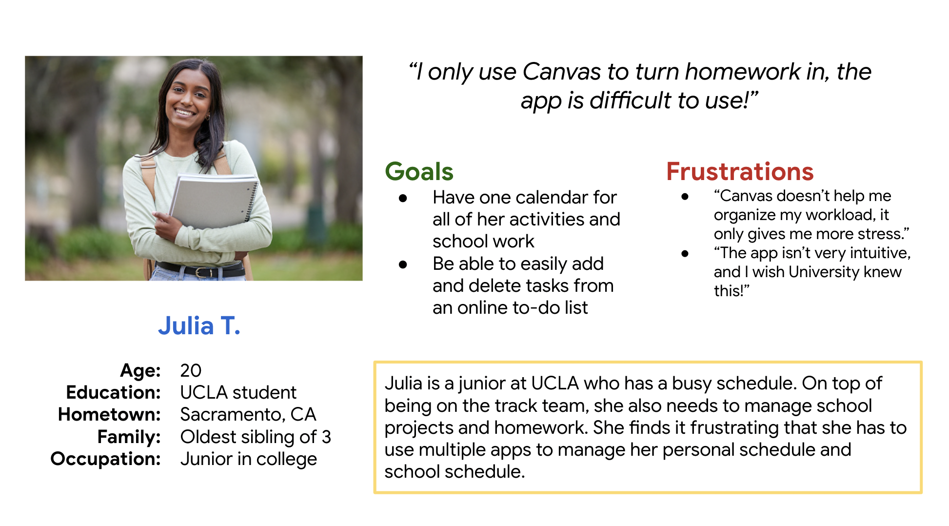
Based on the people I interviewed, I created a persona to embody all of their traits.
Redesign
The new UI needs to include the following features:
1. Easily add and delete tasks
The biggest complaint was that there is no way to delete or cross off a task once you added it to your calendar. Participant A says, “I can’t figure out how to delete the task, that’s super frustrating.”
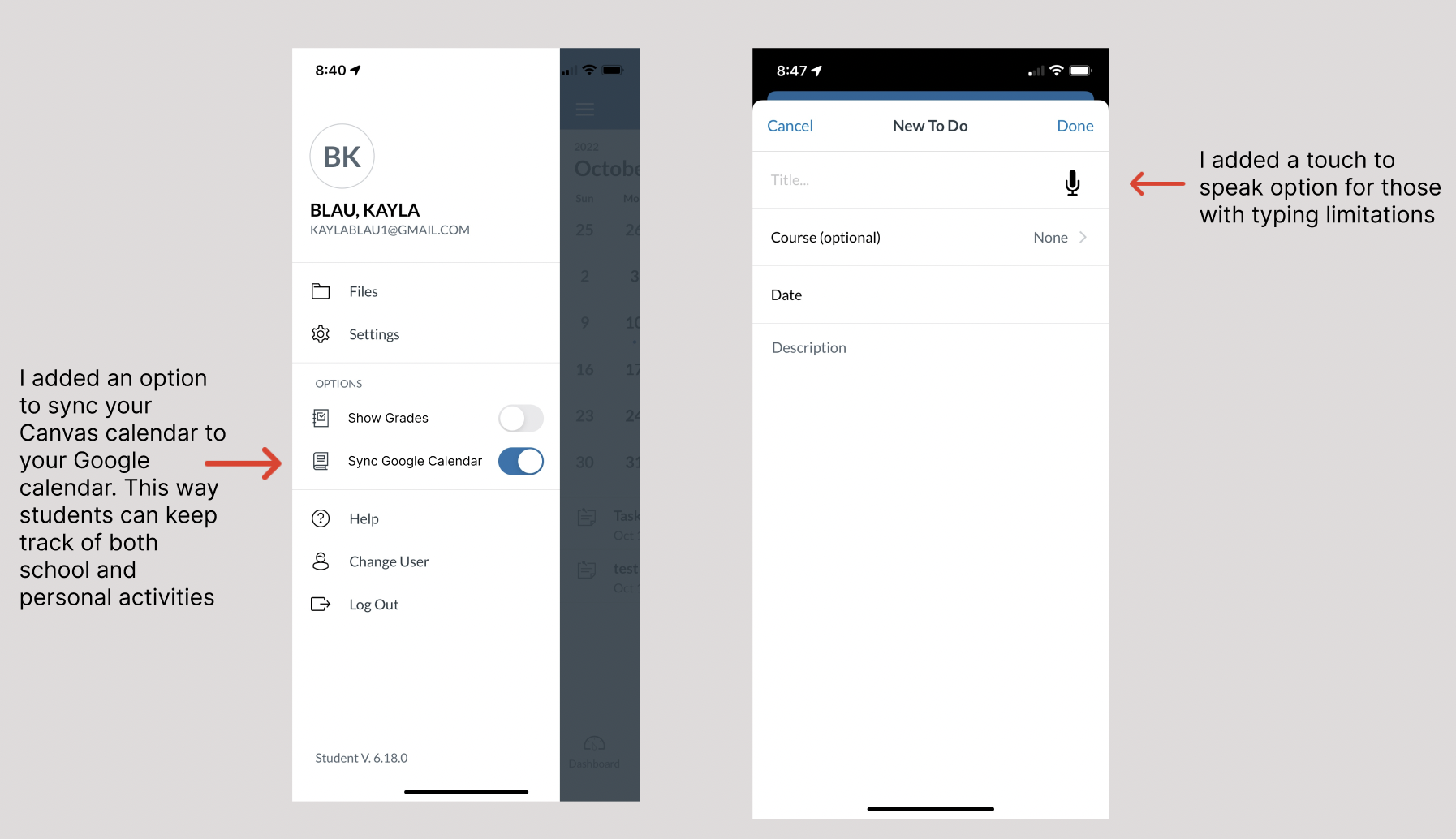
2. Sync Canvas calendar with Google calendar
Students may be more inclined to use the Canvas calendar if it synced to their personal Google calendar. Take for example Julia, she wants one calendar for all of her school work and extracurricular activities.
3. Filter notifications
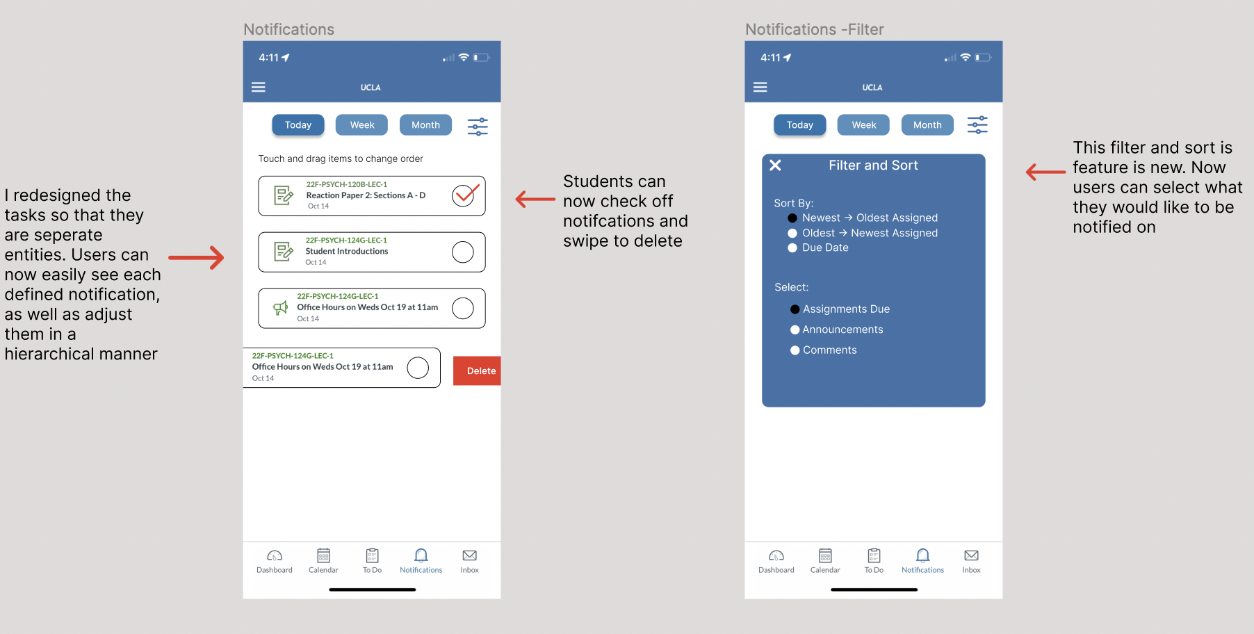
50% of users found that only some of the information from the notifications was relevant to them. It would be useful to add a filter option so the individual can select what they would like to be notified about
Notifications Page
Before
The notification page holds no specific order in which the assignments or announcements are presented, at least to my knowledge. Most students find that only some of the notifications are relevant to them, and 25% find that it doesn’t help them organize. I redesigned this page to include a filter option, and also check off which tasks you accomplish. Checking off a task from a long list gives gratification that will make the user feel accomplished and happy.
After
Calendar
Before
With this calendar, once you added a task, you are unable to delete it. This is a big issue! In my redesign, I included a swipe-to-delete feature. I also included an option to sync the calendar to your Google calendar, as well as added a speak-to-text microphone for accessibility considerations.
After
Validation Testing & Results
In my second round of usability testing, I took my prototype to campus and ran through the same procedure. I recorded the responses and here is some of the feedback I got:
“Whoa, I really like this new feature where I can see my entire day of activities at once.”
“Did you really make this?!”
“This filter feature is great, it would definitely incline me to use the app more.”
Next Steps
The next step I want to take is to interview teachers and professors. I am interested if they are experiencing issues internally on their end, and how I can fix them!
Reflections
This project was a lot of fun for me. Redesigning an application that I use every day felt personal, and I’m glad I got to interview and get feedback from my peers. I had the opportunity to utilize the skills I have been learning from my certification, school, and outside reading and apply them to real life. I know that my work will only improve and I am excited to complete more projects!

